The Houston Central Station Competition called for an iconic landmark
station situated on the median strip on Main Street, between Capitol
and Rusk. Here are the proposals of five award winning firms:
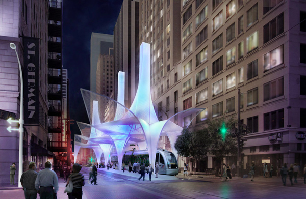
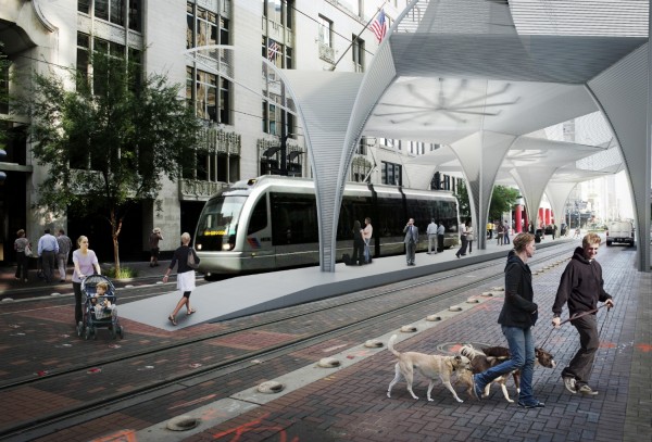
The proposal designed by ShoP Architects
references the form of traditional train stations: columns supporting
vaulted ceilings, lofted spaces that conjured images of grandeur, a
firmness and solidarity that resonated with its surroundings. The tent
like structure stretches beyond the platform, encompassing the
surrounding urban space, thus breaking free from the restrictive narrow
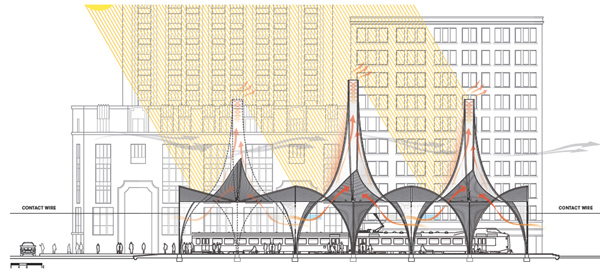
site. The 100 foot solar chimneys provide relief from heat, offer
natural ventilation, helping air circulation. The form of the chimneys
directs the rainwater so it wouldn’t disrupt the passenger flow.
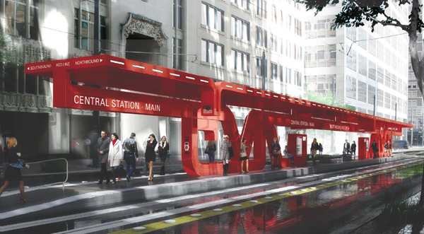
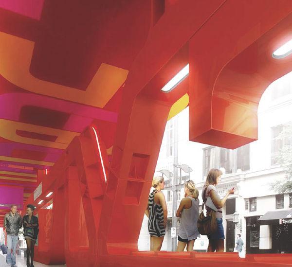
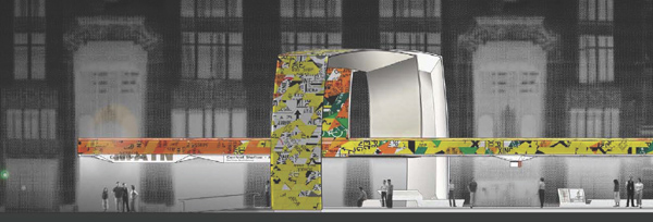
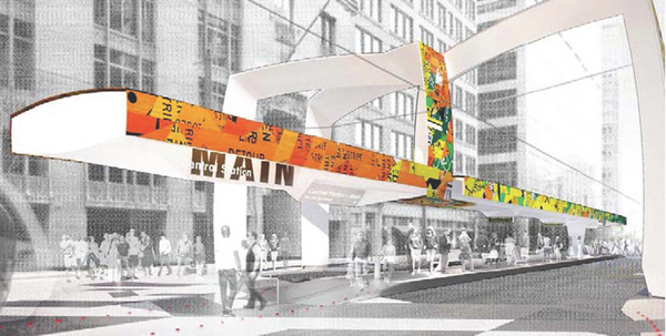
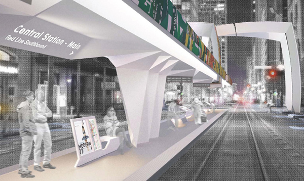
Neil M. Denari Architects
offered a steel structure; the concept was derived from the prevalent
steel buildings of Houston, particularly Mies van der Rohe’s Museum of
Fine Arts. The use of color evokes the surrounding icons of art and
architecture, including sculptural works by Calder and even the George
R. Brown convention center a few blocks away. Structure, signage,
ticketing, lighting and seating are integrated and pertain to the single
unique design gesture.
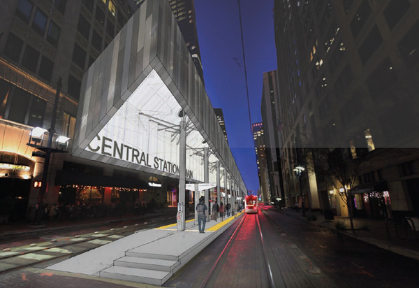
Architects at Lewis Tsurumaki Lewis
envisioned a box like shelter with minimal interventions that marks the
difference between the two directions served by the platform – the
upturned corners transform the box into a structure symbolizing the
anticipation of the arriving train. The structure is held in place by an
array of 2’’ steel rods, which tether the volume to central columns.
Steel is the primary material for the 9’’ vertical cladding strips, with
the interior backlit with LED’s to form a luminous lantern at night.
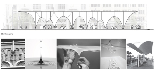
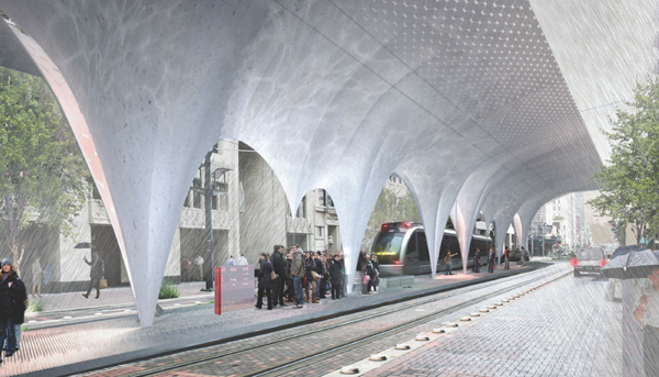
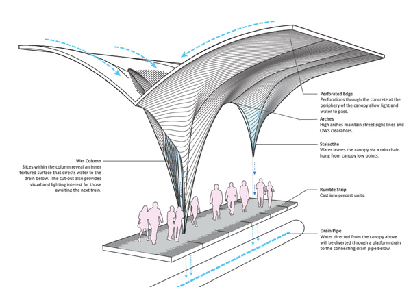
The fact that Houston has a large amount of annual rainfall was the backbone of Snohetta’s
proposal. The design sought to incorporate the concept of water by
channeling rain down concrete spouts, thereby allowing users to interact
with and experience water. The elegant arching structure contains
within columns slices that direct the water to the drain pipes below.
The cut-outs also provide visual and lighting interest for those
awaiting the next train. Though visually engaging the interaction
between users and water might present some practical problems: the areas
of the platform where water is directed would have to be avoided,
causing congestion and removing valuable open space on an already narrow
platform.
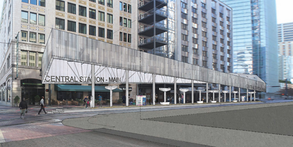
Open Transfer, designed by Interloop Architecture,
proposes a new formal threshold for Central Station. All movement
through the site including light rail customers on foot, light rail
vehicles and private vehicles pass through the threshold as they share
the transfer zone. Characterized by the “spider” column support at the
southern end of the platform canopy, the threshold allows egress from
the platform below to occur unobstructed. Perspective View from
Conductor’s Compartment: The spider column expands the space of the
platform and creates a public threshold for passengers of light rail,
public buses, and private automobiles to participate in the Open
Transfer experience.

Just checking out whose currently following me and found this entry interesting. My thoughts:
Trả lờiXóaThe SHoP entry looks nice, but can you imagine trying to keep it clean? Also from the 2nd photo it looks set to drop water on all those walking up the platform with no drainage.
I really like the idea of the Snøhetta design; being able to watch the water pour through the colums. Again though cleaning out the channels? Leaves getting blown in and stuck; people getting bored and throwing up rocks to watch them clatter down.
So I'd say not very practical for the first two.
Jumping to the Tsurumaki design; it doesn't really stand out. To me it seems that it's trying to be clever for the sake of being clever.
That leaves the Denari and Interloop designs.
The Interloop option is ambitious; I like the way it tries to accommodate the tracks with the over-loops; nice clean lines.
The Denari is simpler, but stands out more and they've cleverly integrated the necessary feature of a station such as the board into the design. It's my favourite of the options.